5 Key UX Tips for Your Website's Homepage
When someone comes to your website, your homepage is the very first thing they see. It’s the gateway to all of your content and sets the tone for what you or your company offers. A visitor could easily click out of your website in seconds if their first impression is subpar – we have gut reactions in 3 seconds or less! So what makes a truly stellar homepage? A truly stellar user experience. Here are five tips for the UX / UI of your homepage that we think are pretty darn important:
You are not the user.
It’s easy to get caught up in how you as a designer, marketer, or business owner want your homepage to look. While you should definitely have substantial input into the look and feel of your website, it’s important to remember that you are not the primary visitor. The first, most basic step in UX is simple: create something the user wants to experience. UX is all about how people interact with your site, combining all of their senses into one individual user context. Give users what they want, plus a little more! Delight the user by exceeding their expectations.
Make it super easy.
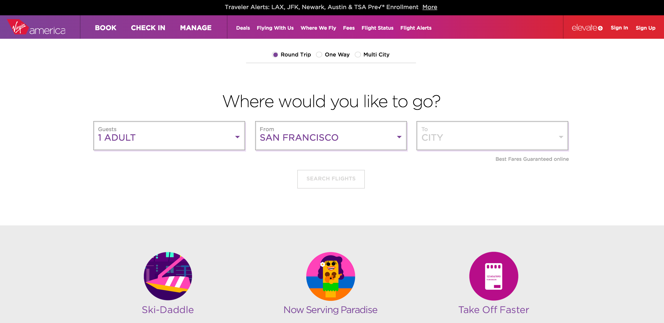
When you head to the mountains for a backpacking trip, you only take the essentials. You pack everything in as efficiently as possible. Taking any extra bulky items would be plain dumb, and you’d kick yourself later on when you’re struggling under the weight of your pack (some of us have learned the hard way). The same principles should apply to the design of your homepage. Intentionally include the most essential elements, and intentionally leave out anything unnecessary. Your homepage should showcase the purpose of your website and allow visitors to immediately understand what your site is all about.
In order to do this effectively, you’ve got to let some things go. While your homepage should certainly be engaging, it doesn’t have to do it all. Some things can wait until a secondary page, and lots of elements don’t even need to be on your website at all!

Make it visually scannable.
Eighty percent of people don’t even read the majority of copy on websites – they scan it. Visitors will absorb more of your homepage's content if your page is easily understood in small sections (think of slicing an apple into bite-size sections rather than biting into the fruit as a whole). Smaller, scannable pieces are also easier to share via social media or other channels. So what makes a page easy to scan?
- Simple words: if you wouldn’t use it in daily conversation, don’t use it on your website.
- Short, concise sentences: get to the point.
- Easily digestible paragraphs: use headlines, subheads and paragraphs to break up the page.
- Liberal white space: comprehension speed increases 14x with more white space around text.
- Images: the brain loves visual things, and a picture is worth a thousand words. Make the most of that!

Clearly direct the user to an action.
Visitors who reach your homepage should want to explore your site more or take a clear action. In order for users to perform the way you want them to, it’s important to guide them with both visual and verbal cues.
- Set it apart. While the CTA should be consistent with the overall feel of the page, using contrasting colors and plenty of negative space around it draws the eye to that specific place.
- Use active words. Using verbs encourages the user to act rather than to deliberate.
- Reduce other options, choices, or ways out. If you need multiple CTAs on your homepage, place them near each other to clearly group all action choices together.
Use SEO best practices.
As Google continues to update its algorithm, SEO at its core should really be focused on getting the right content to the right people. According to Google’s webmaster guidelines, you should “make pages primarily for users, not search engines.” Don’t try to use sneaky tricks – just focus on the basic best practices. Select the right keywords and titles to draw in your target audience and ultimately provide them with what they need.
If your homepage doesn’t have all of these elements, don’t worry about going in and switching everything up! Try walking through your site piece by piece as a user who has never visited your site would experience it. By putting yourself in the user’s shoes, you will be able to rethink your website’s flow, truly understand your potential customers, and create a delightful user experience.