6 Tips for Creating Compelling Calls to Action
There's no question about it. One of the most important aspects of your landing page is its call to action (CTA). This vital element prompts customers to take an additional step: sign up for an email list, download a white paper or even make a purchase. In the past we've discussed the 5 must-have elements of a call to action. Now we're following up with 6 more tips that will help you design a great CTA for your inbound marketing campaign.
So how can you ensure your CTA prompts conversions? Here are six things to consider when writing copy for and designing your CTA.
1. Make It Clear
It should go without saying, but your CTA should be big, bold and noticeable. Don't force the prospect look for it. Make it the most obvious element of your landing page. You should also make customers understand exactly what you want in exchange for what you're offering. If you want them to create an account in order to watch a video, say so clearly. Keep it as simple as possible.

2. Implement White Space
Designers may call it white space, but that doesn't mean it has to be white. The key here is "space." A CTA should stand out from the rest of the page and set it apart as an important element the customer should notice. A cluttered page can be confusing. White space helps draw your visitors eye to where you want them to look.
3. Be Smart About Color
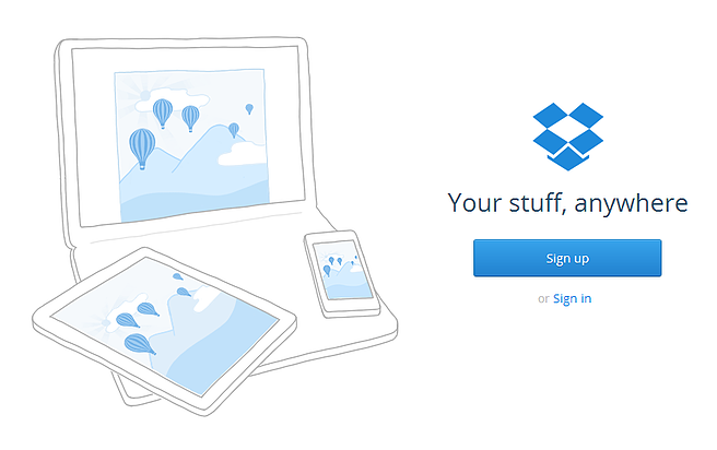
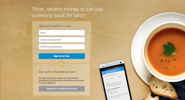
One of the easiest ways to make a CTA prominent is by using color effectively. For example, use contrasting colors to set off the CTA button. Don't use the same color button as the background color of the page. The CTA will get lost in the design. Take PayPal's sign up page as an example. The blue CTA button stands out and is easily identified against the yellow-ish background.
A note about color: We often hear from clients "Well, we ran a test once and green was the best button color" or "I read on a blog somewhere that red is supposed to get the highest click-through-rates." The key with color is that there is no best color. While a blue button may perform significantly better on one website, it may not have the same effect on another. CTAs are all about contrast, so if you have an all blue website, maybe a red or orange CTA would work better than the blue CTA that worked for someone else.
4. Avoid the Word 'Next' or 'Submit'
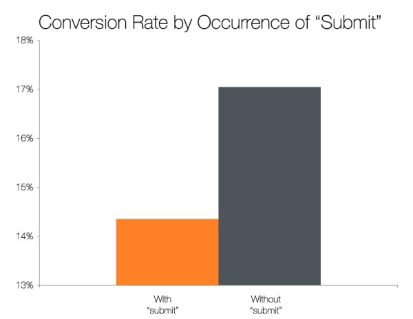
When your CTA button says "next," it can scare customers away. It's has a subliminal effect that makes them think they'll have offer up additional information. "Next" implies a bait and switch is coming and may cause the prospect to navigate elsewhere to avoid disappointment. However, don't use a simple "Submit" either. According to a study done by HubSpot, buttons without the word "submit" have a significantly higher CTR. Make the copy engaging and even fun, but also actionable to see the best results.
5. Create a Sense of Urgency
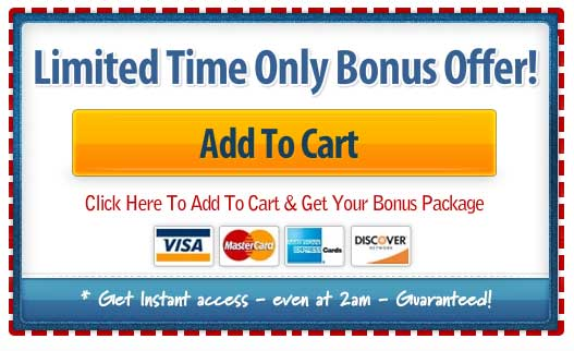
Include a limited time offer or time-sensitive special. This will prompt customers to act quickly for fear of missing the chance to save some money. Make the incentive clear to the customer so they understand exactly what they're getting by clicking the button.
6. Calm Nerves
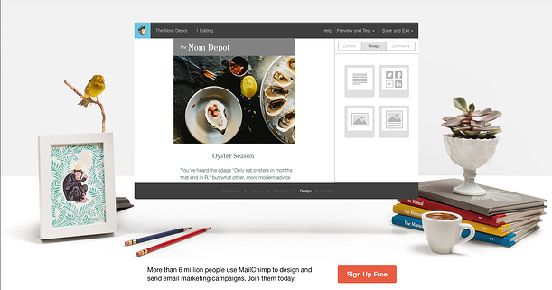
If your CTA involves a potential purchase, reduce customers' anxiety by offering a money-back guarantee or the option to "Take a Tour" or "Try It Free." Ask customers to give you a chance, but promise there will be no hard feelings if they aren't satisfied. If it's a free trial, you may want to add copy that says "No credit card necessary" so people understand it's truly free. MailChimp not only uses a CTA that says "Sign up Free" to reduce anxiety, but also includes supporting copy that "6 million people" are already using MailChimp as a form of social proof.
Calls to action are vital to the landing page conversions. Don't let the design or copy of your CTA drive customers away before they have a chance to act.
Remember, CTAs are only one step of the conversion process. A great CTA will mean nothing if you don't have an optimized landing page. Check out a few of our blog posts for more information:

June 10, 2014
