How to Optimize Your Website for Mobile
Mobile is more important than you think.
Did you know that in 2016, mobile accounted for 51.3% of worldwide traffic eclipsing desktop at 48.7%? This is the first time this has happened in the history of the Internet, and trends indicate that it will continue. Plus, Google themselves announced that they have “begun experiments” to index mobile-sites first over their desktop components which means that mobile performance will be a ranking factor going forward.
The time is now for mobile optimization.
What is Mobile Optimization?
Optimizing your site for mobile is all centered on user experience. And that user experience is based around two factors: speed and design. Design needs to be what is called mobile-friendly or mobile-responsive, and speed, well speed needs to be quick. Do you enjoy going on mobile sites that take forever to load or are incredibly clunky?
Exactly. Lucky for you, mobile optimization is easier than you think, and Google themselves provide tools to help you diagnose and test your mobile site. Let’s dive in.
Test, Test, Test
To see if your site is fully mobile optimized, you’ll have to test for two things: mobile responsiveness and mobile page speed.
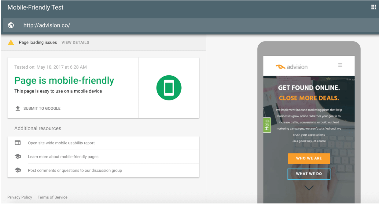
For mobile responsiveness, aka mobile friendliness, access the testing link run through Google Search Console. Side note – if you don’t have Google Search Console installed on your site, do this ASAP. It’s one of the best free tools for digging into how Google is viewing and indexing your site.
.png?width=763&name=Search%20Console%20(1).png "Search Console.png")
The test will indicate if your site is mobile-friendly or not and make design suggestions to improve. In general, mobile-friendly design is a matter of common sense where the guiding principle is less is more. Streamline your form entries, keep your CTAs (calls-to-action) front and center, make it easy to get back to the homepage – anything that would make the mobile user’s experience easier and quicker is recommended. Think about the basics of your site and look up great guides on mobile design best practices to go deeper.
For testing page speed, navigate to the Google PageSpeed Tool. GT Metrix is also a great tool for diagnosing page speed.
.png?width=763&name=Page%20Speed%20(1).png "Page Speed.png")
PageSpeed will let you know how fast your site is on all the devices on a score of 1 to 100 and make suggestions to fix much like the mobile-friendly test.
(Note: At the time of this publishing, Google has just released a comprehensive mobile-friendly and speed testing tool. Rumors say they did this just to make me look stupid.)
Speed Up Your Mobile Site
A very common speed problem in mobile sites is caused by render-blocking Javascript and CSS in above-the-fold content.
These may sound confusing, but are basically anything fancy that you would have on your desktop site that would not translate well to mobile. That above-the-fold distinction is made because that is what is pulled up (and usually takes up the whole screen) when a user visits your site on mobile. This can be everything from custom embedded video players, as seen in our ESPN example above, or super-styled content design.
Of course, fixing these issues depends on the platform on which your website is built – learn more here. If on Wordpress, a great plugin is Autoptimize.
The AMP Future
AMPs, or accelerated mobile pages, are basically a stripped-down version of your full site designed specifically for mobile users. You have probably seen them here or there in your mobile searches – they have a little lightning bolt icon.
.png?width=518&name=AMP%20Identifier%20(1).png)
AMPs load 30x quicker than standard html, tend to rank higher in mobile Google searches than standard pages, and see higher clickthrough rates on average.
While AMPs are still relatively new and used by large publishers and advertisers, given the trend of mobile dominance, it’s a safe bet that they will be the mobile standard in a few years.
If you’d like to give AMPs a shot, www.amproject.com and www.ampbyexample.com have great resources for implementing on non-WordPress sites, and for WordPress, the official AMP plug-in allows you to automatically append your URLs with /amp/ and test the pages versus normal ones for performance benchmarks.
Is the Rest of Your Website Optimized?
Mobile is important but it's just one of the facets of your website. Is the rest of it performing up to snuff? Contact us for a free website analysis today.