The Move to Mobile: Your Survival Guide to Google’s Newest Algorithm
In case you aren’t a search nerd like we all are over here, you might not have gotten word yet of Google’s latest update to the way it ranks websites. Starting tomorrow, April 21, Google will include mobile-friendliness as a ranking criterion in search results. In other words, if your site isn’t fully optimized for mobile devices, your ranking on mobile searches will most likely take a significant hit. 
What does “mobile-friendly” mean, exactly? Well, Google recognizes three different website architectures as “mobile-friendly” – responsive design, dynamic serving, and a separate mobile website. If your website utilizes one of these design structures, it is considered to be optimized for mobile devices by search engines. Not sure of the current state of your mobile site? That brings us to the first step in our survival guide.
Step 1: Test it out.
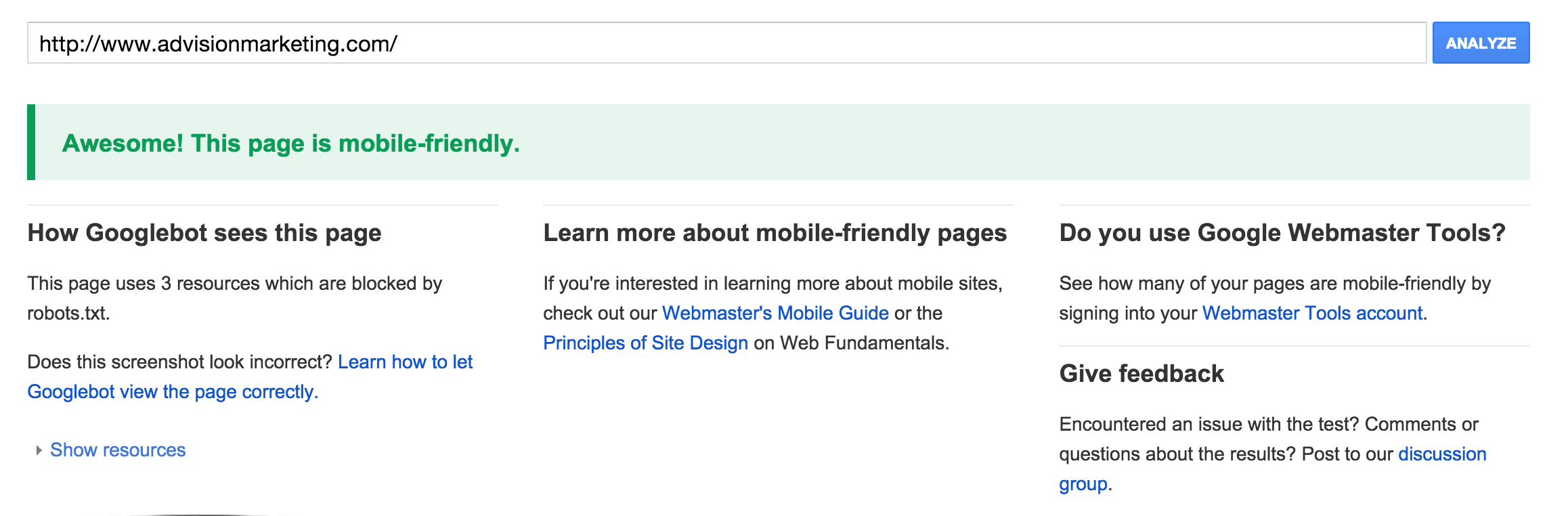
Google has provided this free tool to analyze your website for mobile optimization. This is a quick and easy way to see if and how your site will be affected by the algorithm change.
After you type in your website URL, you’ll see something like this if your site is deemed mobile-friendly.

And you’ll see something like this if your site isn’t optimized for mobile.

Step 2: Optimize!
If your website isn’t mobile-friendly, it’s time to get moving on a version of your site for mobile devices. (If your site gets approval from the Google gods, congratulations! It may still be beneficial to investigate possible tweaks to make it the most user-friendly it can be. We’ll get to that later.)
Remember those three design options we mentioned earlier? Not all are created equal. At AdVision, we recommend responsive design to our clients and institute that website architecture when creating landing pages and other website elements for them. Websites with responsive design adapt and resizes based on the device the visitor is using. A responsive website only has one URL, compared to websites with a separate mobile version that requires the server to redirect to the correct version of the site once it recognizes the device.
Websites with dynamic serving also use the same URL as responsive websites, but since the HTML changes based on the user’s device, it’s a bit more prone to errors than a responsive design. All of this being said, we think it’s worth your while to update your site to responsive design rather than trying to retrofit an already existing design. Check out this mobile guide from Google to help with the process.
3. Get your site up to speed (literally), and ensure security.
Websites that load quickly rank higher on search results than those that lag. If you’re currently on a lower-budget web hosting plan, you may not be doing your website or your business any justice. Plan on putting at least $25 a month toward a hosting provider that will give you higher load speeds and a better foundation. Higher-end hosting services are also generally more secure and can provide site owners with a custom SSL certificate, meaning that the website must establish a secure connection. A secure website will always include https:// at the beginning of the URL. Google will begin to factor in security levels in its search algorithm, so it’s a good idea to go ahead and cover your bases.
4. Leverage this change as more marketing power!
The cold and hard truth is that with this update, time is money. Each day that your website isn’t mobile-friendly is a day with reduced traffic. But it’s also important to realize that this change is a good thing – optimizing your website for mobile customers means that they will have a better shopping experience, ultimately leading to more conversions and revenue for your business. If you have any questions about the algorithm change or want to speak with us more about how we can help improve your digital marketing strategy, feel free to get in touch with us. We would love to chat!